It was another day for bears to tighten the squeeze. For the first time in 2016, having recently tagged such levels in August/September 2015, the S&P returned to the 15% percentile of historic weak prices dating back to 1950. The index is firmly on course to retest the aforementioned August and September double bottom, when the S&P went as far as to hit the key 10% loss below its 200-day MA. This period of weakness is not unusual for the S&P. And a drop to 20% below its 200-day MA sometime this year, and possibly next, would not be unreasonable - as the table below illustrates:
If we take the assumption the S&P is in a long term accumulation phase, buying to hold for the long haul using small orders could be the theme for the rest of the year.
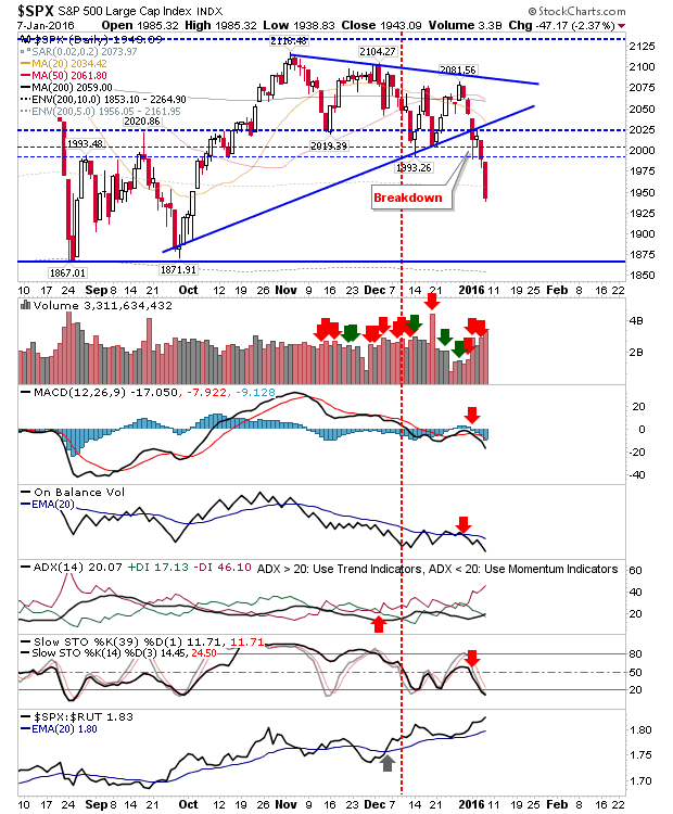
The chart shows the S&P tagging the light grey hashed line marking the 5% envelope (-5%) around the 200-day MA. The slightly darker grey line marking the 10% envelope (-10%) is at 1,956.
The Russell 2000 was the other big loser on the day as it surpassed the lows of August and September, pushing it into the 10% percentile of historic lows (dating back to 1987). There is a big jump to the 5% percentile, where a near 15% loss against the 200-day MA is required, but the chart does not make for pretty viewing:
I tried to fish for a bounce in $IWM at the 10 am reversal hour in my
eToro account, but it was quickly stopped out. It has been a nickle-and-dime set of losses for this trading account, but it's a great way to keep my hands off my investment account.
The Nasdaq hasn't yet qualified for the 15% percentile, but it's close. A 7% loss against the 200-day MA will qualify it.
Unfortunately, volatility only looks to be kicking off, and a move more like 2011 (or 2008) would appear required before the Nasdaq sees a bottom. Note, this is a
monthly chart:
Hat-tip to J.C. Parets for this chart of
his. My added spin is below: if the XLY:XLP ratio breaks the swing lows from last year, combined with crosses below the mid-line of stochastics [39,1], KST and MACD zero lines, then things could get real ugly quickly:
Another ugly chart from my stocklist archives can be found
here.
Transports have already reached the 2011 stage of declines. The question is whether they rally off the 200-day MA, or slice clean through and enter a more protracted decline. The next couple of weeks will be critical here.
Finally,
Nasdaq breadth isn't yet at the 2011 stage lows, although it's close. The Nasdaq Summation Index is looking like it will be the last metric to reach deep oversold levels (at -800 or below). The ugliest chart of the set is the percentage of Nasdaq stocks above their 200-day MA. Don't be surprised if this drops to 10% or worse; it's looking a lot weaker than it did in 2011 when it came close to this level.
I would be more confident going forward if we saw a decent sell off, even one which took us into 2017. Strong buying opportunities present themselves every few years and while September/October 2015 did offer one such play, it had come too early in the bear cycle. If you are a bull, embrace the red and don't be afraid to accumulate good names on the cheap.
You've now read my opinion, next read
Douglas' and
Jani's.
UPDATE: I like this scenario from
here. I tend to view the 2009 low as a generational low too.
---
Accepting KIVA gift certificates to help support the work on this blog. All certificates gifted are
converted into loans for those who need the help more.
Follow Me on Twitter
Dr. Declan Fallon is the Senior Market Technician and Community Director for
Zignals.com, and Product Development Manager for
ActivateClients.com. I also trade on
eToro and can be copied for free.
JOIN ZIGNALS TODAY - IT'S FREE!